
If you're a Product Designer, you've likely experienced a time when you've been deep in a design, attempting to pull off a clever solution only to be met with more and more complexity around every corner. You’re bogged down in details that shouldn’t have been there in the first place. You’re playing whack-a-mole with edge cases and firefighting complications of your own making. The further you go, the more you lose sight of the real goal.
I’ve been there more times than I care to admit.
What starts as an attempt to make the best solution possible, ends in something hard to make sense of – for you, as well as your users.
There is a temptation to over-index on the clever solution with the idea that if we handle all the edge cases for users and plumb in intricate logic, we’ll end up with a more “complete” experience. But the truth is, too often a solution becomes more complicated than it needs to be. Fortunately, we can draw upon a tool that can help to correct the path.
Enter: Occam's Razor
I first encountered Occam's Razor during a Critical Thinking module in my Philosophy degree. It is a principle popularised by William of Ockham, a 14th-century English Franciscan friar who argued:
Plurality should not be posited without necessity.
But what does that mean? At its core, Occam's Razor is a problem-solving heuristic. Modern interpretations of this translate as simply Don’t make things more complicated than they need to be.
It’s a mental model that helps reframe complexity into its simplest useful form.
The problem with simplicity
It’s tempting to reduce this principle to “make things simpler” but that misses the point. Simplicity isn’t the absence of complexity, it’s the absence of unnecessary complexity. It is more a way of finding simplicity within complexity.
Unfortunately, Occam's Razor isn't a magic wand that you can shake at your Figma file to make it all better. In reality, finding the right balance between too simple and overly complex is a tightrope. Knowing when, and how, to cut out unnecessary complexity comes with experience and even then, the most seasoned designers will still occasionally pursue the perfect solution.
Simplicity holds almost Holy Grail status in design, and it makes sense:
A user interface is like a joke. If you have to explain it, it’s not that good.
Because of this, some products or experiences are full of UI tricks like hidden gestures, or long-press to reveal overflow menus, for example. These types of patterns can introduce a lack of discoverability. It might reduce visual complexity but at the cost of clarity. Similarly, in an effort to simplify, we might encapsulate heavy, complex operations behind a single button. However, this can have drawbacks: if a user clicks a button and doesn’t know exactly what it’ll do, it can erode confidence and trust.
Some product experiences are inescapably complex. The job isn’t to pretend those complexities don’t exist but to handle them responsibly. Simplicity doesn’t mean stripping things bare or rejecting complexity entirely. It means avoiding unnecessary complexity. A product should be no more and no less than what’s needed to solve the problem effectively.
A practical example
At itris, I had worked on a design for a modal and posted it in a chat with the product team for feedback.
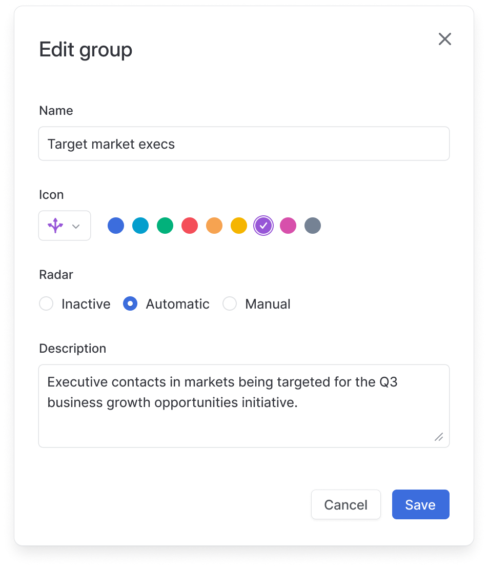
A designer that I was mentoring made a comment on the Save button saying:
Just to check… this button will be disabled until the user makes a change, right?
He later referenced Don Norman’s first usability heuristic, visibility of system status – if there’s nothing to save, logically the users shouldn't be able to save. It was a fair point. Disabling the button would offer feedback on the form's current state.
However, disabling would add unnecessary complexity. We would have to:
- Track whether the user has made any changes
- Compare the current form state to the original
-
Handle edge cases like:
- What if they changed the icon colour or radar type and then changed it back?
- What if they typed some whitespace into the name or description fields?
All that effort to make the button logic water-tight to prevent… what, exactly?
Saving a form that hasn’t changed is harmless. Borrowing a programming principle, it is idempotent meaning that you can do it repeatedly without changing the result. So why block the user from doing it?
Some might argue that disabling the button is a best practice, but best practices are starting points, not hard rules, and they aren’t always the best fit. The trade-off here is that the UX technically goes against best practice, but leaving the button enabled works just fine and no extra logic is necessary.
Sometimes the simplest, most obvious solution is also the best one. It's not about being rigid with best practices, it's about making thoughtful trade-offs.
Choosing what matters
Occam’s Razor is a powerful principle that can guide clearer, simpler decisions when things start to get bloated or overcomplicated. It encourages us to ask critical questions:
- Is this a real user need or an internal bias?
- Are we overvaluing edge cases?
- Are we adding logic that benefits the user, or just adding logic?
This principle has repeatedly helped me step back, rethink a direction, and cut through the noise. Not by focusing on minimalism, but by focusing on what’s essential.
Just because you can design something, doesn’t mean you should.