
ON THIS PAGE
ON THIS PAGE
Context
In early 2024, I led the research and design of a scalable KPI system that adapts to companies of any size or type, helping to mitigate a £1.4m revenue risk. The project was complex and ambiguous, full of unknowns, constraints, and edge cases. We delivered a flexible, high-impact solution that directly addressed growing customer churn and lost deals.
itris, a Recruitment CRM, was lacking crucial KPI functionality that left customers with no choice but to export reports and track KPIs manually through spreadsheets which was inefficient and frustrating for customers. For recruiters, KPIs influence bonuses, promotions, and performance reviews. For companies, they indicate profitability and efficiency.
"This is currently really difficult to manage within itris (unless we are doing it wrong..)"
"Please, please, please can you add a way to easily track performance and targets for our consultants. I'm having to pull 7 reports a week into excel to work out OTE and it is so time consuming!"
Process
The top-level process for this project included:
- Identifying customer pain points and challenging assumptions around how customers might use KPIs.
- Defining goals for users and aligning the project with business objectives.
- Running a customer survey and follow-up interviews to uncover how teams really set and track KPIs.
- Collaborating closely with product, engineering, and QA to scope an initial version that balanced flexibility with usability.
- Designing a new configuration model that reduced user effort, was flexible enough to support different customer needs and allowed nuanced control over metric resets, filters, and effective dates.
Goals
User
- Remove user frustration.
- Provide a streamlined, efficient and flexible way to track metrics.
- Users should be able to drill down into the data behind the metrics.
- Users should have a single place to visualise their KPIs.
Business
- Protect the risked revenue.
- Reduce the risk of customer churn.
- Remove barriers to sales conversions.
Key insights
Targetless KPIs
During the survey, I identified a theme in the responses that changed how we thought about KPIs. We initially assumed that KPIs would be inherently target-based, but after following up with some respondents, it became clear that some customers simply wanted visibility of performance without targets. This subtle but important insight changed our approach as we knew we needed to cater to both target and targetless KPIs to meet customer needs.
Pivot in the configuration model
Initially, we agreed on a model that would see KPIs assigned to users individually but we realised quickly that this would exponentially increase admin effort as you could have 10 users with 10 KPIs to update (100 KPIs). Instead, I proposed flipping the model to centralise KPIs instead, defining them once and assigning users / teams. This dramatically reduced admin overhead and made changes easier to manage.
Outcome
We delivered:
- A scalable KPI model that works across team structures and workflows.
- A dashboard that makes performance instantly visible, including drill-downs and exports.
- Support for both individual and team targets, as well as targetless performance tracking.
- Clearer, more actionable performance data without the need for spreadsheets.
Impact
While the full release is pending, the early feedback loop with sales demos and customer conversations confirmed strong alignment with market needs. Early indications gave key stakeholders confidence that the revenue gap could be narrowed. This work directly addressed known pain points and is expected to lead to more deal conversions and a lower risk to revenue.
Reflections
- Designing for flexibility is hard — every option adds a layer of additional complexity. I focused on sensible defaults, clear guardrails, and signposting to maintain usability.
- Research moved the goalposts — without follow-ups, we would've missed the value of targetless KPIs.
Interest to know more about the full design process, trade-offs, and edge cases? Switch to the deep dive version, or alternatively, please get in touch.
UI designs
Note: The UI in this case study represents the direction I was taking as part of a product redesign initiative. Although the redesign was later deprioritised and not released, this work is a more accurate reflection of my current UI design style.
If managers and recruiters can easily set and track KPIs, they can drive individual performance, team success, and business profitability. Addressing that gap was essential to revenue protection.
Building this functionality inside a recruitment CRM platform used by hundreds of agencies, each with different team structures, workflows, industries and metrics, required designing across vastly different user structures and needs.
In early 2024, I led customer research, challenged assumptions around performance tracking, and designed a scalable KPI system that adapts to companies of any size or type.
This case study outlines how I helped the team navigate a complex space full of unknowns, constraints, and edge cases to deliver a flexible and scalable KPI system.

Background
itris is a Recruitment CRM used by staffing agencies to run their businesses. At its core, itris combines the functionality of a sales tool, Applicant Tracking System (ATS), and Customer Relationship Management (CRM) solution into one platform.
Targets are commonplace in sales environments. The recruitment industry is numbers-driven and KPIs play a critical role in measuring individual, team, and organisational performance. For recruiters, these metrics influence promotions, pay reviews, and commissions, making them a powerful motivator. For a business, these metrics indicate profitability and efficiency, among other things. By providing clarity and focus on targets, KPIs help individuals understand expectations, driving both personal and business success.
Problem
While itris had a robust and powerful reporting suite, users couldn't:
- Set performance targets for individuals, teams or the company
- Track and measure those targets over time
- Visualise progress in one place
Without this functionality, recruiters and managers were left exporting spreadsheets, building workarounds, or giving up entirely.
Customers were increasingly frustrated, and the gap was hurting the business with an estimated £1.4 million in annual revenue at risk from churn and lost deals.
"This is currently really difficult to manage within itris (unless we are doing it wrong..)"
"Please, please, please can you add a way to easily track performance and targets for our consultants. I'm having to pull 7 reports a week into excel to work out OTE and it is so time consuming!"
Customers needed a better way to assign and track targets and assess user, team and organisational performance in a simple, intuitive way.
Challenge
The recruitment industry spans every type of work and every type of sector and our customer base reflected that. Some agencies specialised by industry, others by function, and some had unique team structures or workflows that needed to be catered for. Anything we designed needed to flex across all of them.
From a KPIs point of view, we had to ask: What would be the most effective way to deliver a robust set of functionality that is flexible enough to accommodate all of the variations and use cases?
The data was already there. Our challenge was to transform it into something tangible that recruitment teams could use to understand their performance and their expectations.
Discovery
At the start of the project, I knew there would be a lot of unknowns. To deliver a good solution, I would need to spend more time researching, learning, and speaking with customers.
I started by gathering everything we already knew:
- Feedback from sales demos
- Feedback from customers
- Competitive research into other CRMs and standalone KPI tools
- Secondary research to understand common KPI tracking practices used by sales teams across different industries
Customer and prospect feedback was a major source of insight at itris, and we already had a good baseline of information to work from. However, I still had some unanswered questions. I didn't feel confident yet that we fully understood customer needs, particularly around nuances like team structures, target management, and reporting workflows.
To deepen our understanding and validate assumptions, we decided to run a customer survey.
Survey
I worked closely with the Product Manager to build a survey that would help us better understand customer needs around KPIs and performance tracking. Our goals were to:
- Learn how customers are currently tracking KPIs
- Identify the most valuable metrics to include
- Understand the most common configurations (individual vs collective, reset intervals, review frequency)
- Gather insight on how KPI data would be used
Key insights
The biggest takeaways we had were:
- The importance of KPIs to customers was rated 8.74 out of 10
- The importance of drill down into KPIs data was rated 9.17 out of 10
- Most of the respondents were using manual CSV exports to track performance
- Many set collective team KPIs, not just individual ones
- Weekly and monthly were the most common reset frequencies
- Targets were typically reviewed monthly or quarterly
- Months and quarters were treated exclusively as calendar months, not 30 or 90 days
This feedback proved to be incredibly valuable and made me much
more confident in an approach. However, there was interesting
theme that emerged from survey that we hadn't previously
considered. Historically, we understood KPIs to be intrinsically
A good number of the respondents explained that they treated KPI as much more of a business-level metric where they didn't necessarily need a target assigned, but wanted to see the performance on it's own to monitor activity rather than performance. This became a key insight, and one that, as a team, we wouldn't have considered in the initial scope without conducting the survey and following up with customers.
Design explorations
Armed with a better understanding of the customer need, I started exploring some solutions. The project was split up into 2 main parts:
- Configuration - The part that solves the directors and managers needs
- Dashboards - The part that solved the user needs
Configuring KPIs
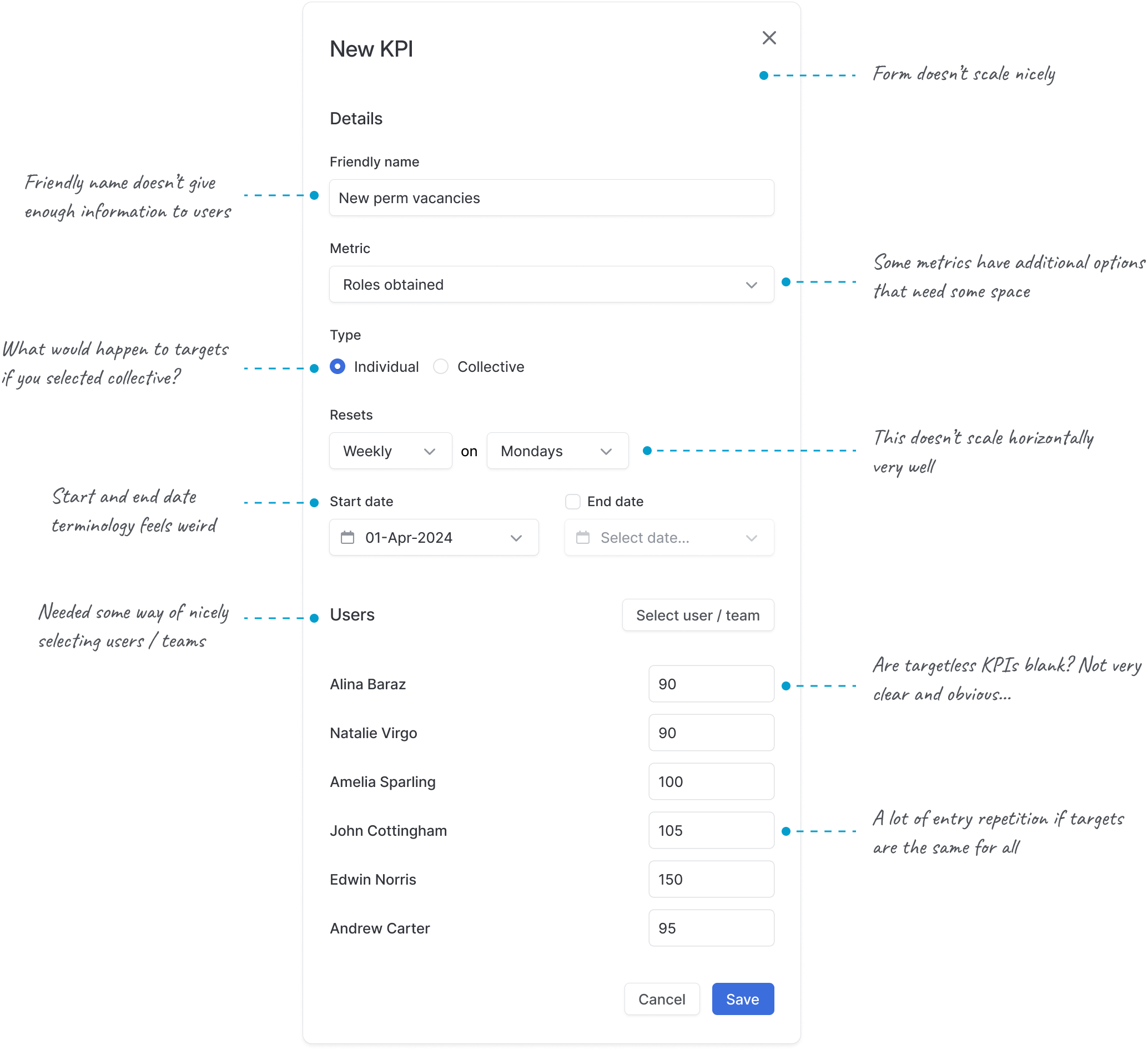
The natural place to start was configuration. This was, however, undoubtedly the most tricky part of the project. For KPI configuration users initially needed to be able to:
- Select a metric to track (a total of 25 initial metrics were agreed for the initial scope)
- Choose the reset interval (the duration)
- Set the start and end dates of a KPI to track and audit historical data
- Select affiliate users and/or teams
- Set whether the KPI includes a target and, if it does, configure the targets value
Initial model: User-owned KPIs
The most obvious and simplistic solution was assigning KPIs directly to users and teams in a user-owned model where each user or team would have their own unique KPI configurations. I explored this option, but this quickly proved to be inflexible and it wouldn't scale at all.
We knew from additional information gathered in the survey that KPIs weren't a one size fits all for some organisations, particularly for customers who had a much more nuanced approach that was based on seniority, experience, and expectations. For smaller companies, this might be manageable but if a 50-user agency needed 10 KPIs each, admins would be managing 500 unique KPIs with updates required every month or quarter. For larger organisations, this manual overhead was a non-starter. We needed a better model.
A pivot: Centralised KPIs
After several iterations and getting nowhere, I proposed flipping the model.
Instead of assigning individual KPIs to each user, was there a way we could treat a KPI as a source of truth and simply assign users to it? We knew that users might share the same KPI template, albeit the target might be slightly different. This alternative approach brought major benefits:
- A single source of truth for configuration
- Changes would cascade to all users unless explicitly overridden
- Supported both individual and collective targets
- Reduced manual work for admins
After some initial ideas in Figma, it became apparent that the trickiest part of this model would be gracefully handling multiple users or teams in the same KPI configuration, with the potential of having different targets.
An agreed configuration
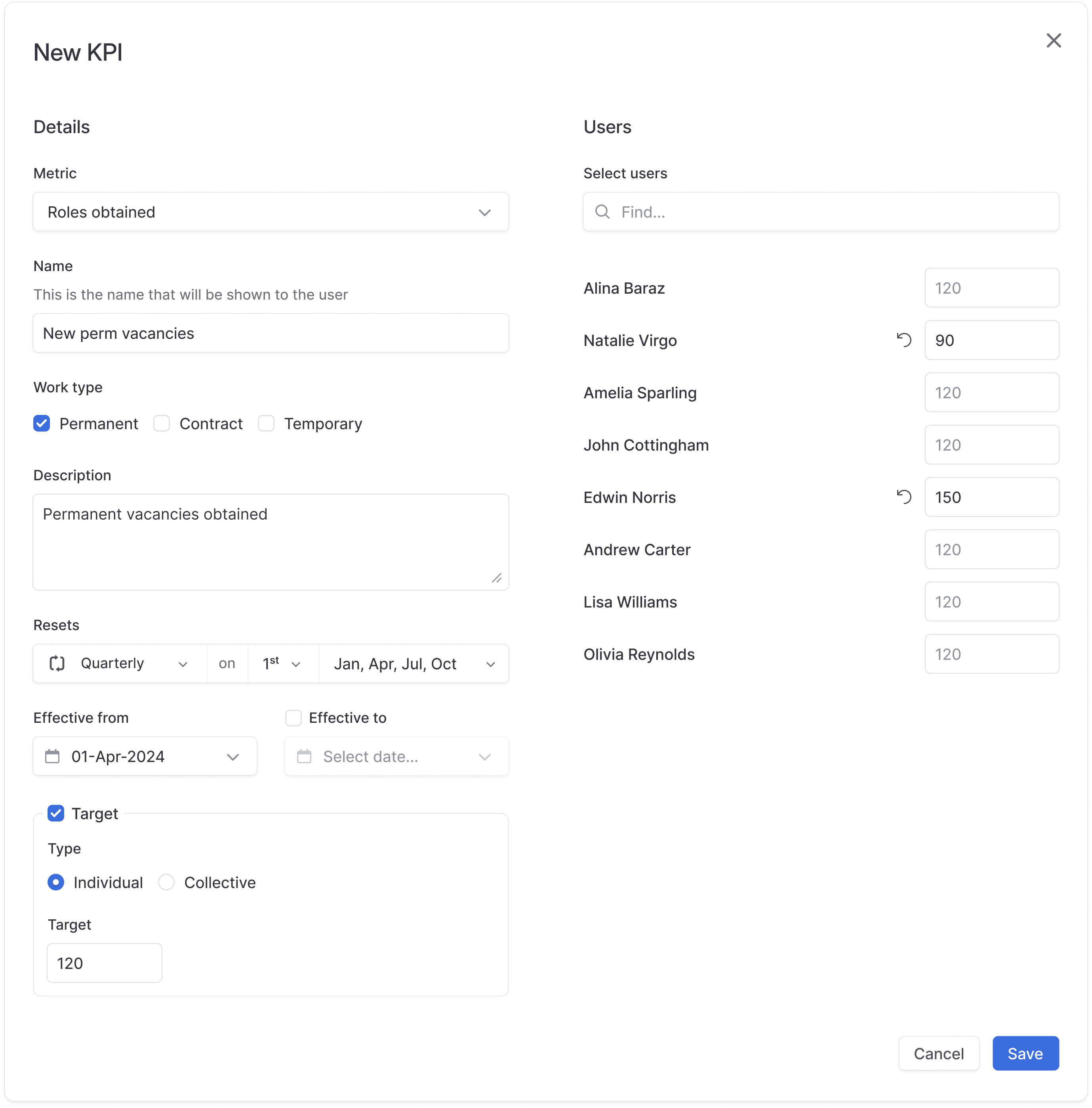
After a number of rounds of iterations, collaborating with the product team, an engineer and the sales director, we had a much better idea of what a KPI configuration looked like.
Each KPI would include:
- Metric: What are we tracking? (e.g. Jobs obtained)
- Name: An option for customers to use their own terminology (e.g. Inbound Vacancies)
- Description: An optional text box for customers to inform users on how that can contribute to this KPI
- Filters: Additional filters depending on the metric (some metrics required more granularity than others)
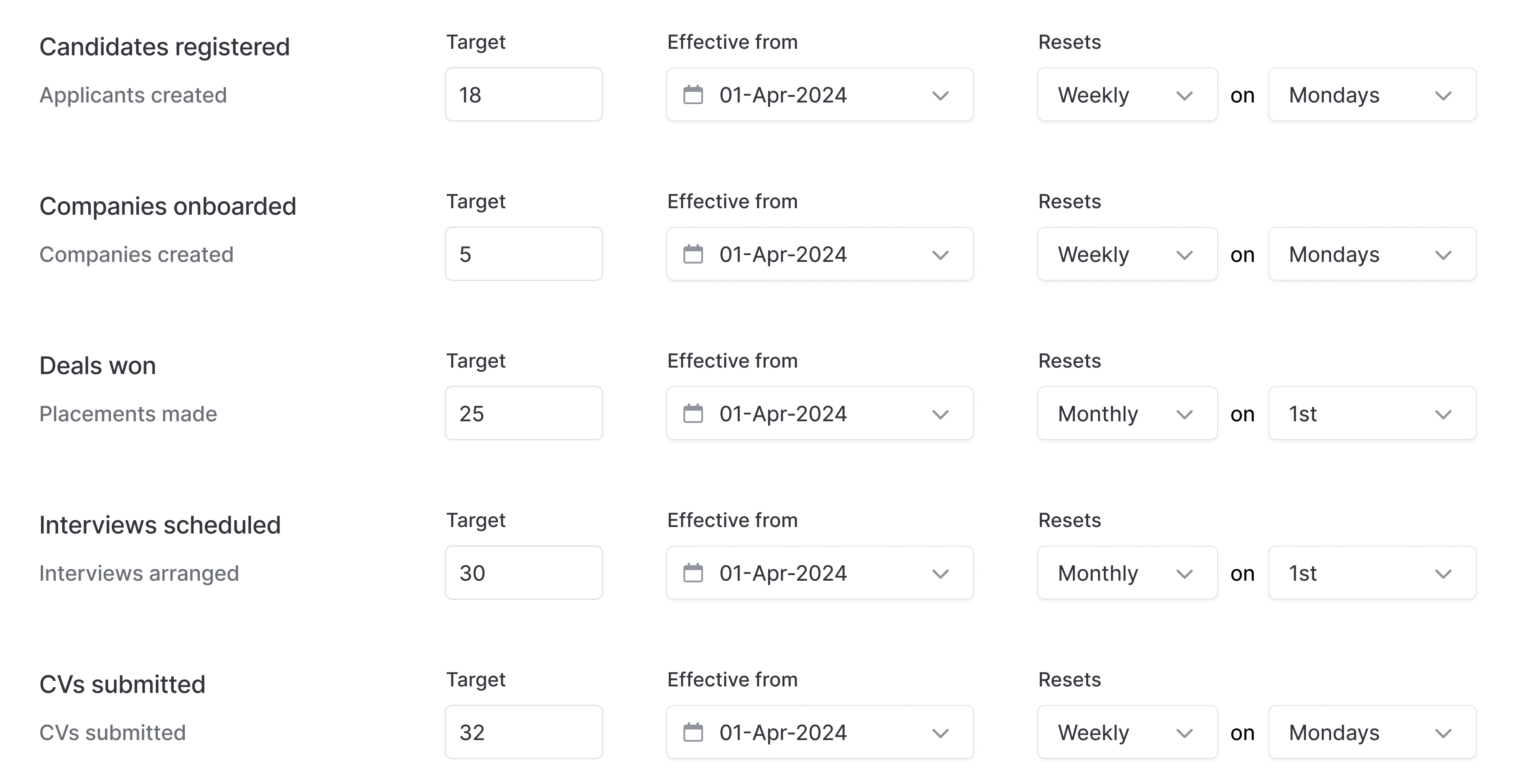
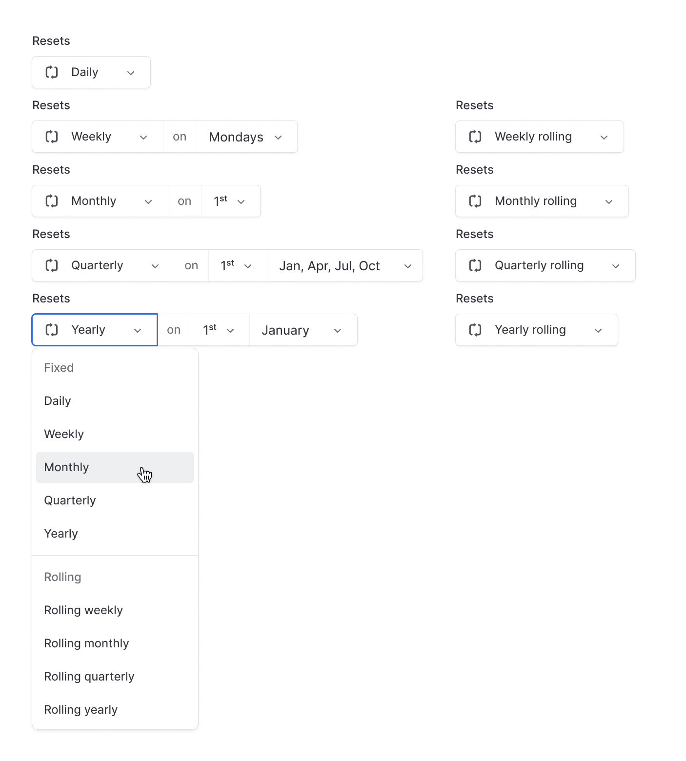
- Reset Interval: How often did the target reset? Daily, weekly, monthly, quarterly or annually. This also included options for rolling weeks, months, quarters and years.
- Effective Dates: Window for the KPI to be relevant (essential for accurate historical KPI data audits and updates)
- Target: Optional target that supports numeric, monetary or percentage values
- Target Type: Set whether the KPI targets individuals or a collection of users / teams
- Assigned Users / Teams: Who is assigned to this KPI?
This model allowed for more nuanced setup including tailoring targets to individuals and adding or removing users or teams from a target easily.
Noteworthy details
Reset component
The reset component needed to cater for lots of different configurations. I designed a flexible component that would allow this nuance.
Collective KPIs
We initially assumed collective KPIs would be important, and the survey confirmed it. Nearly half of respondents advocated for a collective option, so we made it a core part of the design.
By selecting Collective as the target type, the target was attributed to a group of users / teams, rather than individuals. For example, a group of five recruiters might have a quarterly target of 150 new jobs obtained. This balanced over and under-performers within the group and had a successful outcome when the combined total hits the target.
Default target inheritance
When setting individual targets, users could set a default value at the KPI level. This default was immediately inherited by any user or team assigned to the KPI, making KPI management much more scalable.
However, we needed a way for users to optionally set custom target values at the individual level. To achieve this, we used an input that displayed the inherited default target as a placeholder. This allowed users to enter a custom value if needed. When a custom value was entered, a reset button appeared next to the field, enabling users to easily revert back to the default.
This wasn't the best solution. The placeholder styling made the field appear disabled, and the lack of strong affordance could cause confusion. We consciously accepted this trade-off due to project timelines with a plan to gather user feedback and refine it in future iterations.

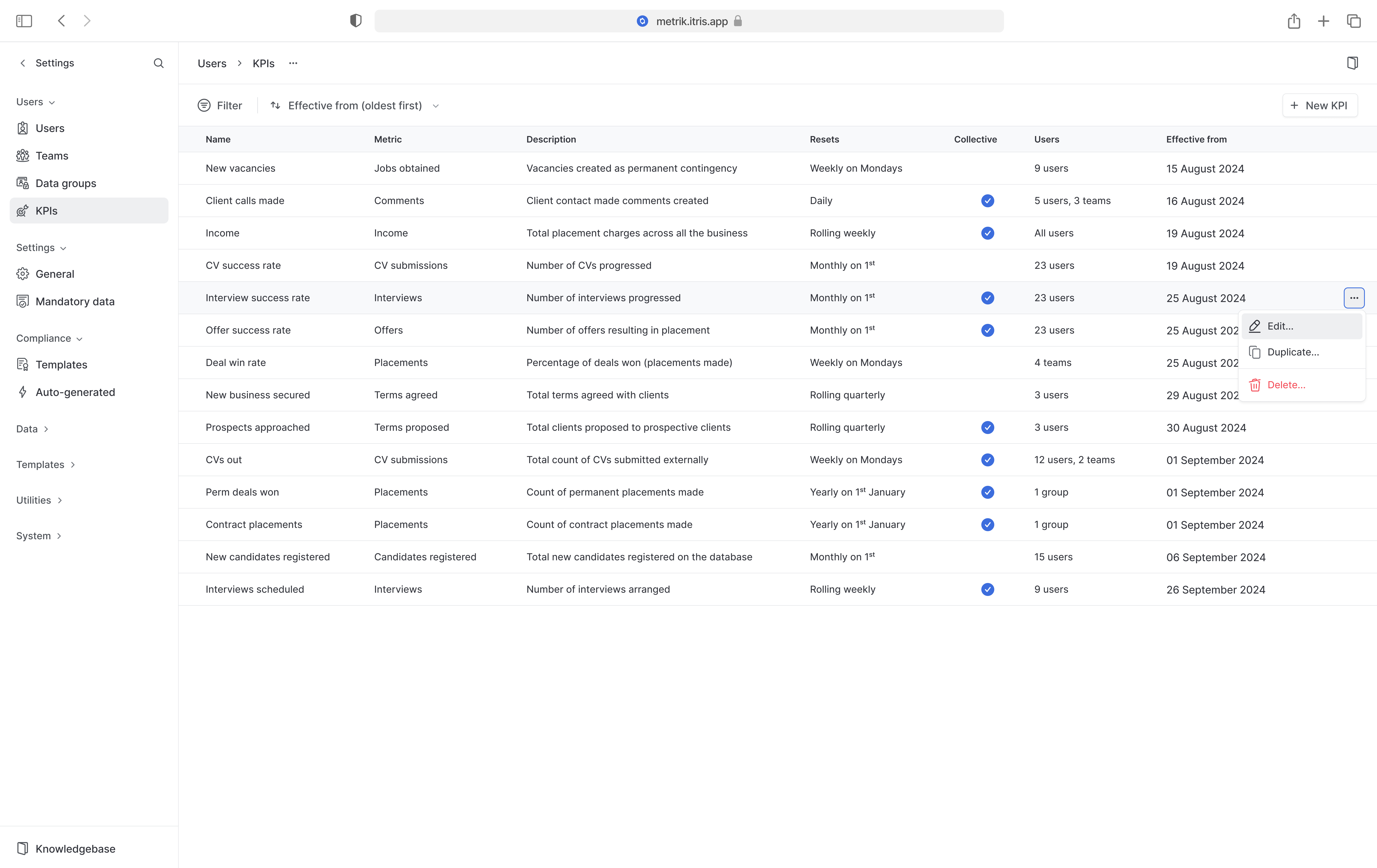
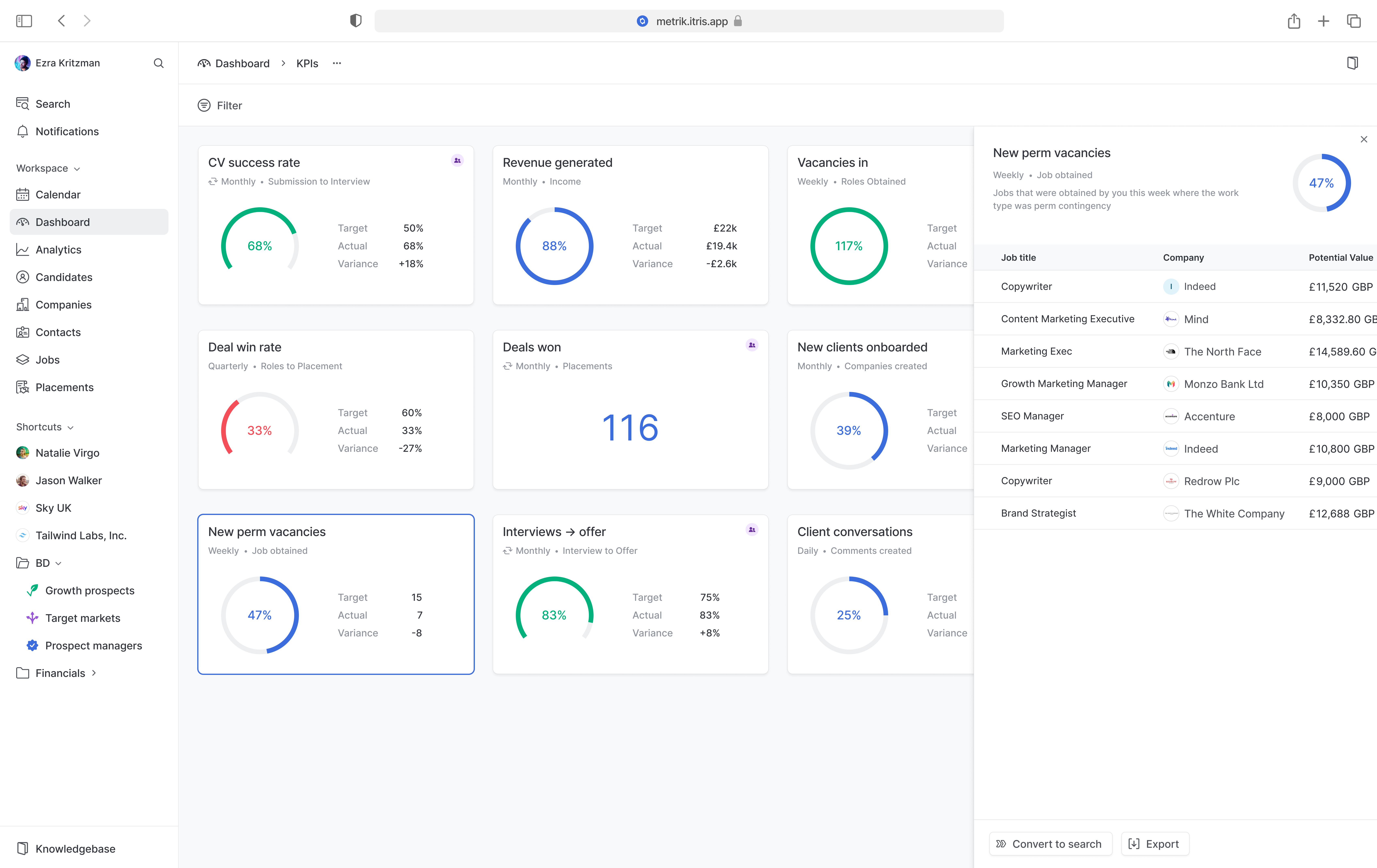
The KPI list
Once a KPI had been configured, it was displayed in a table with all of the information needed.
Widgets
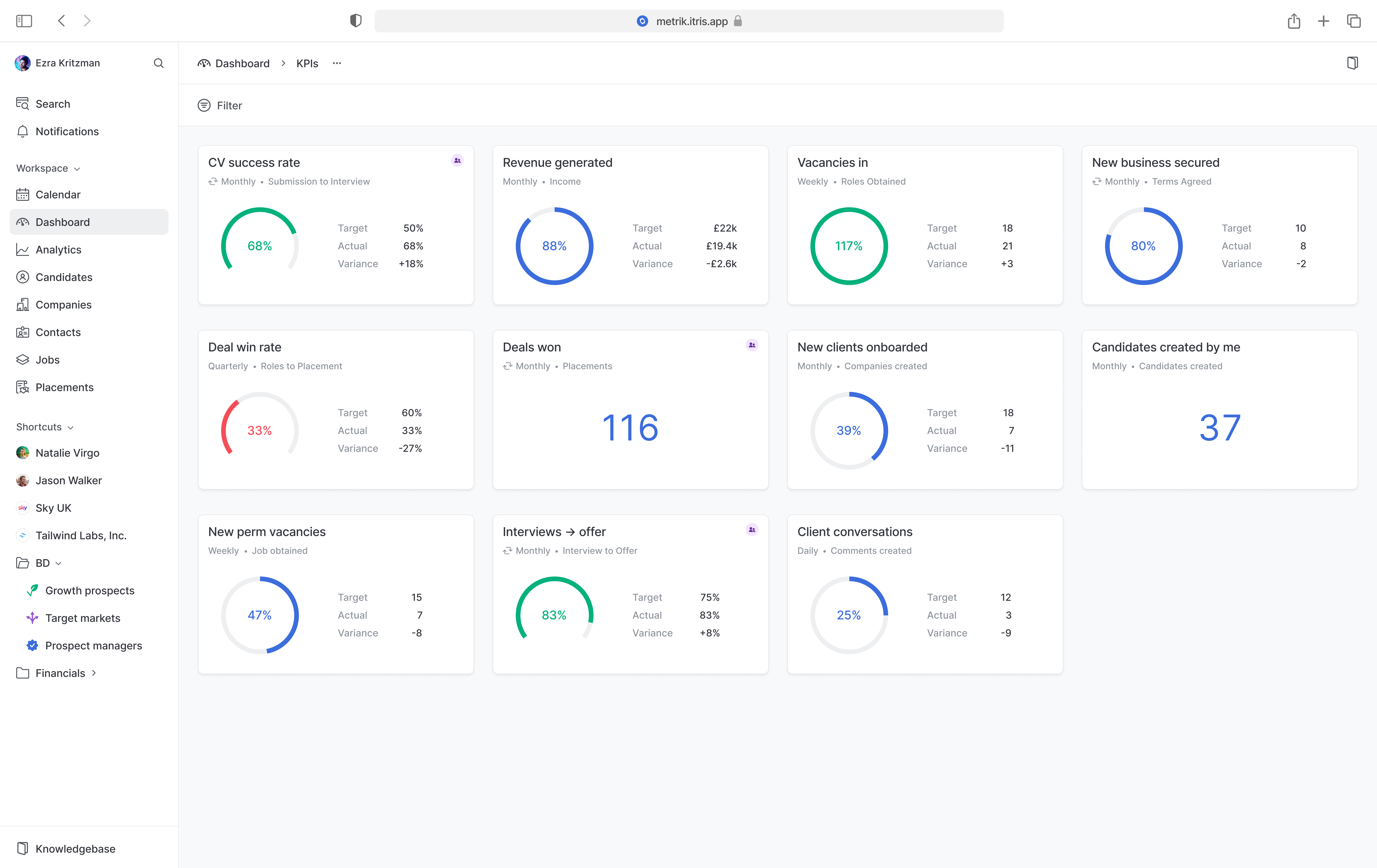
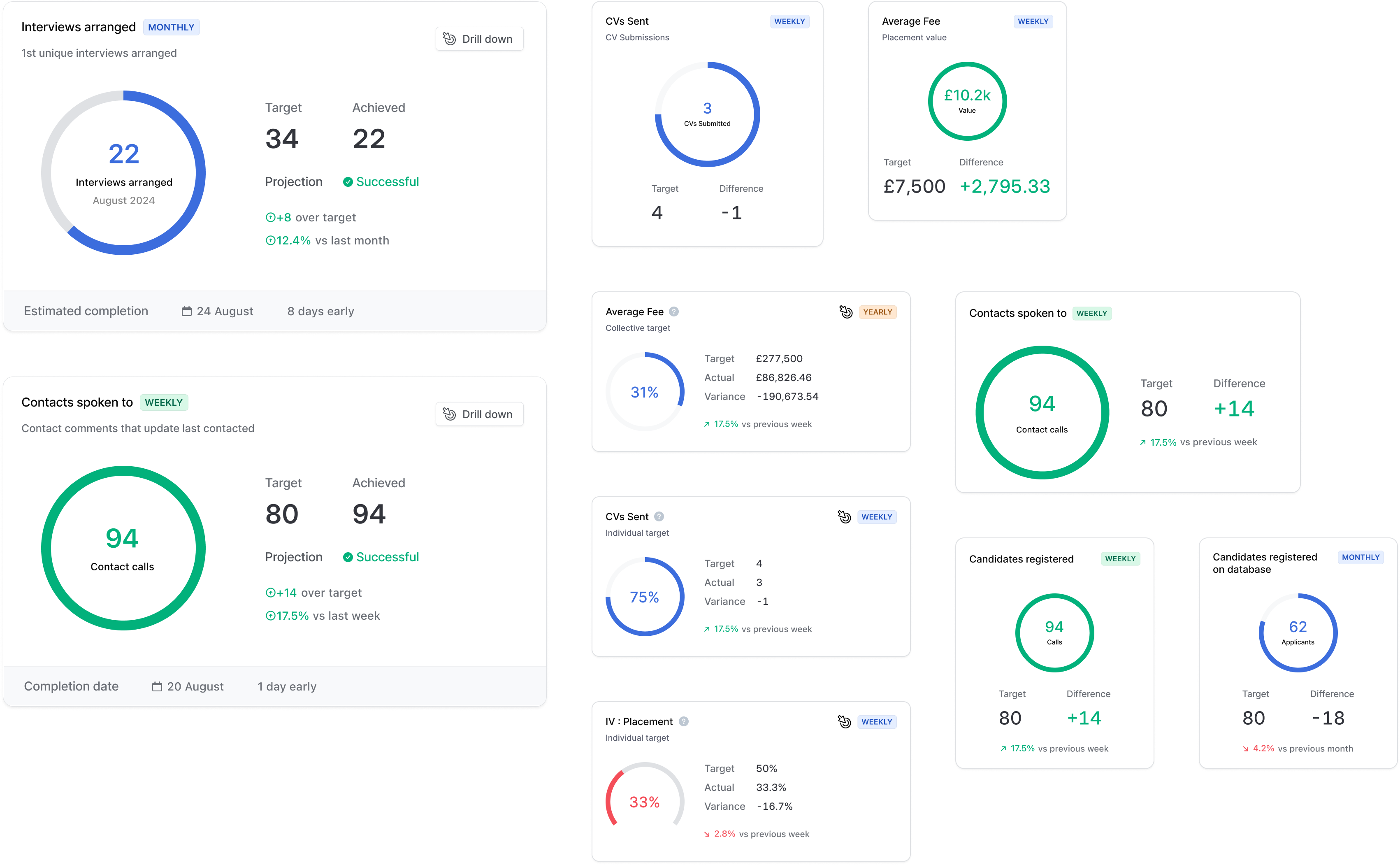
Once the configuration was complete, I moved onto the KPI dashboard. This dashboard needed to provide a simple and effective way for users to understand everything they needed to know about where they were with their performance at the current point in time.
The layout scaffold of the dashboard was a common pattern that we already used for business intelligence dashboards so the widgets were the main point of focus in this stage of the design.
The main challenge here was balancing information density and visual clarity.
It was important to make key details immediately obvious without creating visual clutter. With the constraint of the appropriate widget size and the amount of potential information, this was a tough task.
In some cases, users could see over 20 widgets in this dashboard so I need to ensure that the widgets showed enough information to inform the user without overwhelming them.
In the initial planning, we explored including features like outcome projections and comparisons to previous periods within the widgets. However, as we developed the concept further, we realised these additions complicated the design and added more complexity to an already significant project. To maintain a clean, usable interface and keep the initial release focused, we made the decision to de-prioritise these features. This allowed us to reduce visual noise and deliver a clearer, more streamlined user experience, while keeping the door open to introducing these ideas in future iterations.
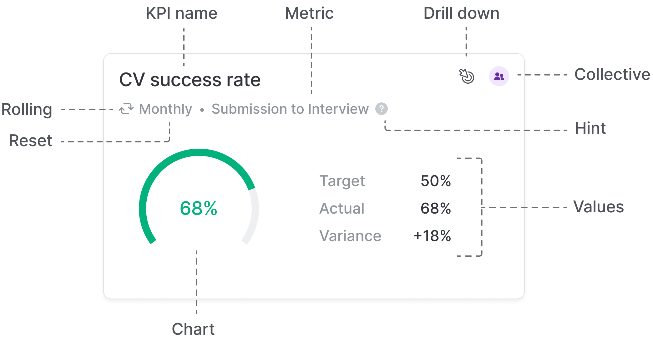
After a number of discussions with engineers and the product team, we settled on a much more simple design. The final widget had:
- The heading section is clear and shows enough primary information for the KPI
- Secondary information like description is available through clearly sign-posted hint in the hover state (not all KPIs had hints, so this made the IA more consistent and predictable).
- A button for drilling down into the data behind the KPI (when hovering)
- A coloured indicator to clearly represent collective KPIs
- A minimal donut or gauge chart depending on whether the value was a percentage or not
- Clear statistical data preseted to the user
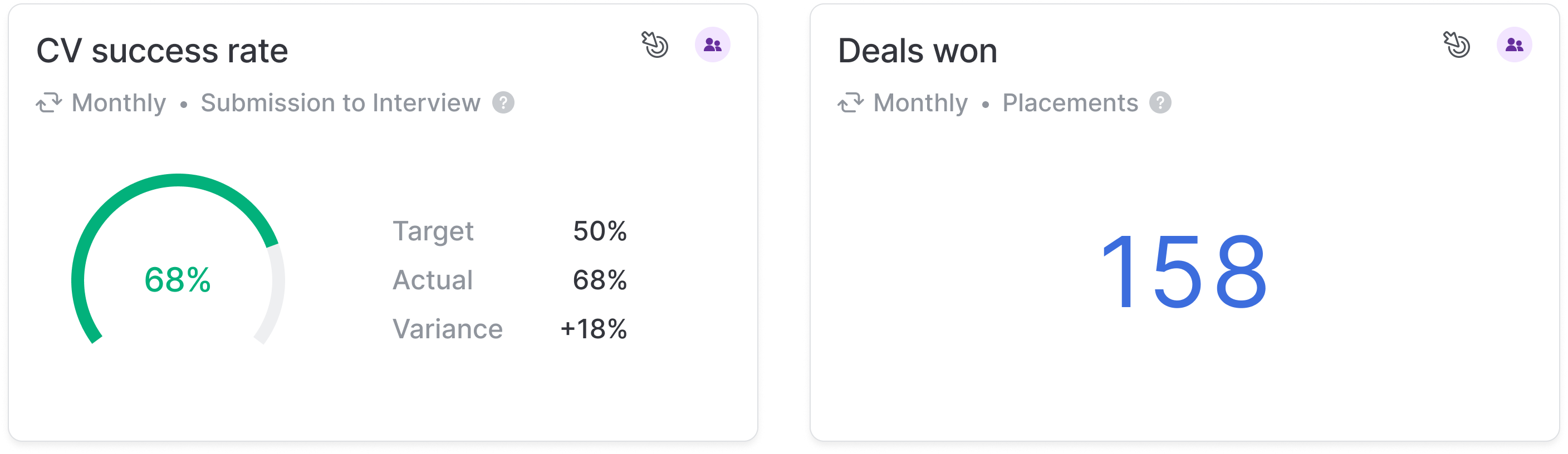
The result was a clean, breathable KPI widget layout that, when replicated across an entire dashboard, had a good visual balance and hierarchy.
Drilling down was also available through a side panel that overlayed the dashboard. The most important parts here was being able to export or convert to a search. Converting to a search was a powerful option because it would allow further manipulation to drill into the data even further.
Outcome
While the full release is pending, the early feedback loop with sales demos and customer conversations confirmed strong alignment with market needs. Early indications gave key stakeholders confidence that the revenue gap could be narrowed. This work directly addressed known pain points and is expected to lead to more deal conversions and a lower risk to revenue.
Reflections
Navigating competing priorities
At the time this project was being worked on, the business was in the middle of being acquired. This created competing demands for attention and resource and so ruthless prioritisation and scope management were essential to keeping up momentum.
Designing for flexibility
When adding flexibility to a product, it inherently comes with the risk of decreased usability. Every layer of complexity introduced the risk of confusion for users. We had to ensure that there were sensible defaults, learning resources signposted in key areas and guardrails to stop users from getting lost in the configuration.
After collaborating with the Training Manager on some details, she suggested that we should include a set of default, targetless KPIs as part of the release in order to aid learning. This was a great idea and subsequently added as a separate project.
The benefits of research
We initially assumed KPIs were purely target-driven. Qualitative follow-ups proved that many customers prioritised visibility over targets. This insight fundamentally shifted our approach and made the final design far more aligned with customer needs.
Future opportunities
Given more time, I would have loved to explore:
- AI-driven projections and recommendations
- Support for historical comparisons and trends over time
I believe both would further enhance the platform's value to recruitment teams
The UI in this case study represents the direction I was taking
as part of a product redesign initiative. Although the project
was later deprioritised and not released, this work is a more
accurate reflection of my current design approach.
If you'd like to know more about this project, please
get in touch.